 log in
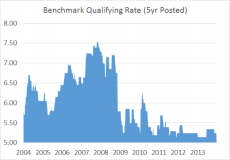
Mortgage Rate Curve – May 11, 2014
The chart below shows the average best rates for each common mortgage term. This graph provides a sense for how much of a rate premium you’ll pay for the security of a longer term and/or fixed rate. Key Takeaways: The difference (spread) between 5-year fixed and variable rates remains tight by historical standards at roughly 0.59 percentage points. The long-term...